Bitwarden users often mention the product’s simple UI and robust features. Last year several large product updates were released, including Bitwarden Send, Provider Portal, and additional Organization management settings. With more planned for 2022 on the roadmap, it became evident that a Vault Refresh would help pave the way for these new and exciting features. In the most recent Bitwarden release, the first steps provide a simplified and more streamlined user experience. Let’s dive into the feedback and research that drove the design.
Customer feedback and research
Prior to beginning any work on a vault refresh, it is important to understand existing vault experiences, and how each user’s involvement differs based on their BItwarden plan type, and what improvement opportunities exist.
The team started by reviewing Community Forum posts, client interviews, and cross functional collaboration to discover the main usability opportunities within the current version. The goal was to add insight to the user and customer feedback already received and understand how individual opportunities related to one another.
After consolidating the comments, suggestions, and user insights, some high-level priorities for improvement became apparent:
Organization Administrators:
Navigating between the Vault experience and the Organization management settings
Premium and Organization Members:
Navigating between Organization vault view and the My Vault view
Differences between Subscription and Billing pages
Finding and understanding value of vault health reports
Understanding who owns each item in the My Vault view
The last item in particular was a high priority, as knowing which items belonged to an individual and which to an organization is an important distinction when managing sensitive credentials.
Planning and content mapping
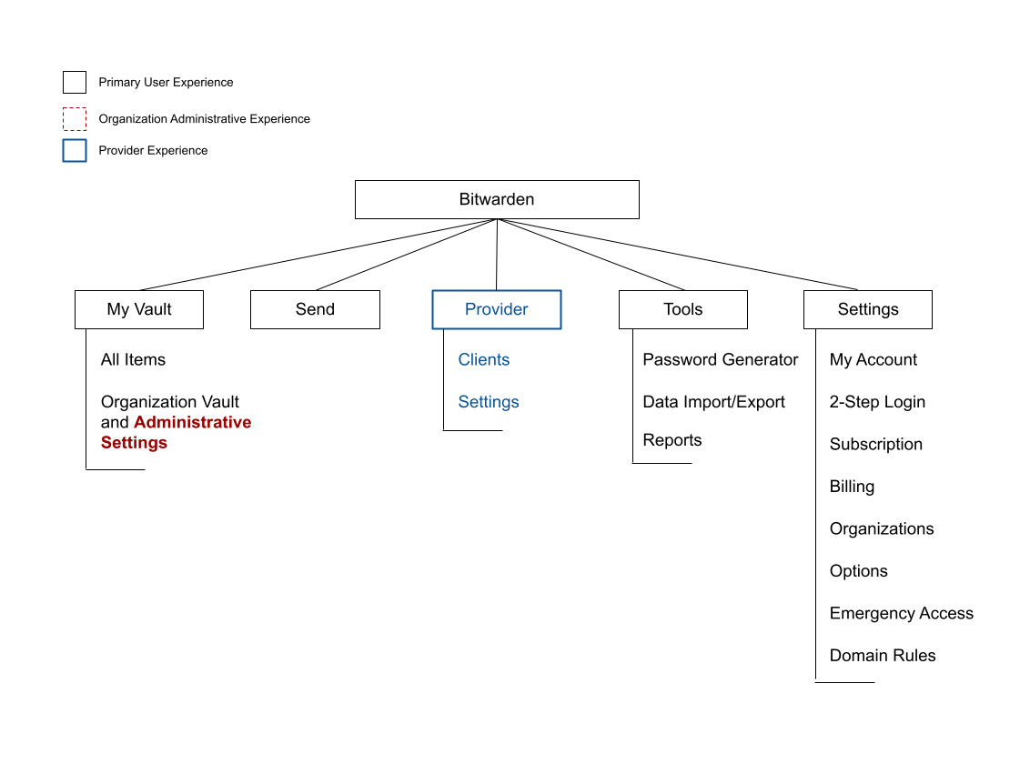
With a clearer understanding of these opportunities, the team reviewed the existing information architecture to understand the current content organization and how each feature and page mapped to each of the Bitwarden Plan types.

With the existing experience visualized and the set of usability opportunities as a guide, the team mapped out new content structure possibilities for the Vault experience. The resulting updated model focused on clarifying the differing experiences that organization members (and premium members) have from the organization administrative experience. Since both of these user types use the Web Vault differently, it was important to create a customized experience based on the goals each of these users had when visiting the Web Vault.

Following this content mapping based on user type, the team proceeded to update Web Vault pages to match the revised structure.
Prototype and testing
With the revised vault pages and structure created, a prototype of the changes was created and tested to see if the updated changes improved new users’ experience with Bitwarden. The team gave users a series of tasks to complete, observed how they completed the tasks, and noted any areas they found difficult. This feedback informed final refinements to the design.
The design process also included reviewing the new layouts and prototypes with internal cross-functional groups. These reviews helped lead to a further breakdown of content in the Security and Subscription pages (shown below).
The updated vault experience
Starting with the challenge of understanding vault item ownership, the new refresh includes a vault filter and ownership column. This vault filter allows you to show:
My Vault – items owned by you
An organization vault – items owned by your organization, or
All Vaults – items from all vaults you have access to.
The vault filter allows greater flexibility in managing all your items directly from a single view, making it easier to find, edit, and manage your Bitwarden credentials.


Another update that users may immediately notice is the removal of the “Organizations” card on the right side of the Vaults screen. For the organization members, this card served to filter their vault to show the items related to this organization. By adding the vault filter functionality, it was clear that removing this card would simplify the vault experience for users without administrative permissions. Organization administrators now have a designated link in the navigation, described later.
Reports are now highlighted in the top level navigation, and a new Security page in Account Settings was introduced, all making it simpler to access and manage your vault health and account security.

To further consolidate Settings, subscription, payment, and billing content were also grouped into one area with each subject clearly labeled.

Finally, organization administrators can now seamlessly access admin tools from any page within the Web Vault. The Organization link was moved from the Vaults view and now resides in the top level navigation. This change also simplifies the Web Vault interface for non administrator Bitwarden users, as the Organization link remains hidden.

One opportunity from an organization administrator’s perspective that was not addressed in this refresh was to improve the relationship between items and collections, and users and groups; especially when creating these relationships from the existing Manage tab. A solution to this will soon be coming in a future phase of the vault refresh work. Stay tuned!
Roundup
Our hope is that users find this new update intuitive and that it provides easier access to managing vault items and account settings. As always, user feedback is welcomed from the amazing Bitwarden community that is always a source of valuable insights. This update today represents a step in the journey for providing a smooth experience for all users, with more exciting updates and initiatives to come!
Interested in trying Bitwarden for yourself or start a free trial for your business? Visit bitwarden.com to get started!
More about the Bitwarden design philosophy can be found here in a previous blog.
